Choropleth Map Re-do
Essentials of the assignment: Re-create a poorly-designed choropleth map. sUse layers. Save as a png and pdf. Insert into a web page with associated metadata (see code below).
- Examine choropleth maps available through an image search. Be able to describe what's wrong with each.
- Map layout is the basis of map design. It is essentially an artistic process that is governed by an implicit graphical grammar.
- Many books have been written in cartography and for GIS professionals to help make well-designed maps. Google Search.
- If the maps available through the Internet are any indication, these books have not helped.
- Sounding stupid and looking stupid.
- Studies have shown that well-designed maps are viewed as more trustworthy and believable.
Basic elements of a map:
- A title that clearly states what the map shows. plus relevant dates;
- A legend to interpret the content of the map. the meaning of all symbol and colors ;
- source and author;
- Neatline. The neatline helps "contain" the map elements. It brings order and structure;
- Optional element: a scale bar that translates distance on the map to distance on the ground. Often not included. Scale is never consistent on all parts of smaller scale maps and not relevant for a thematic map;
- Optional element: orientation. The north arrow is often omitted on maps that have north on top. Depending on the projection, a north arrow does not apply to all parts of a map It is not relevant for most thematic maps.
What to think about:
- Visual center is always above the actual center.
- Golden proportions and the rule of thirds. Pictures.
- Appropriate level of generalization. Map generalization.
- Legibility. Images.
- Harmonious design.
- Hierarchy.
- Goals of good map design.
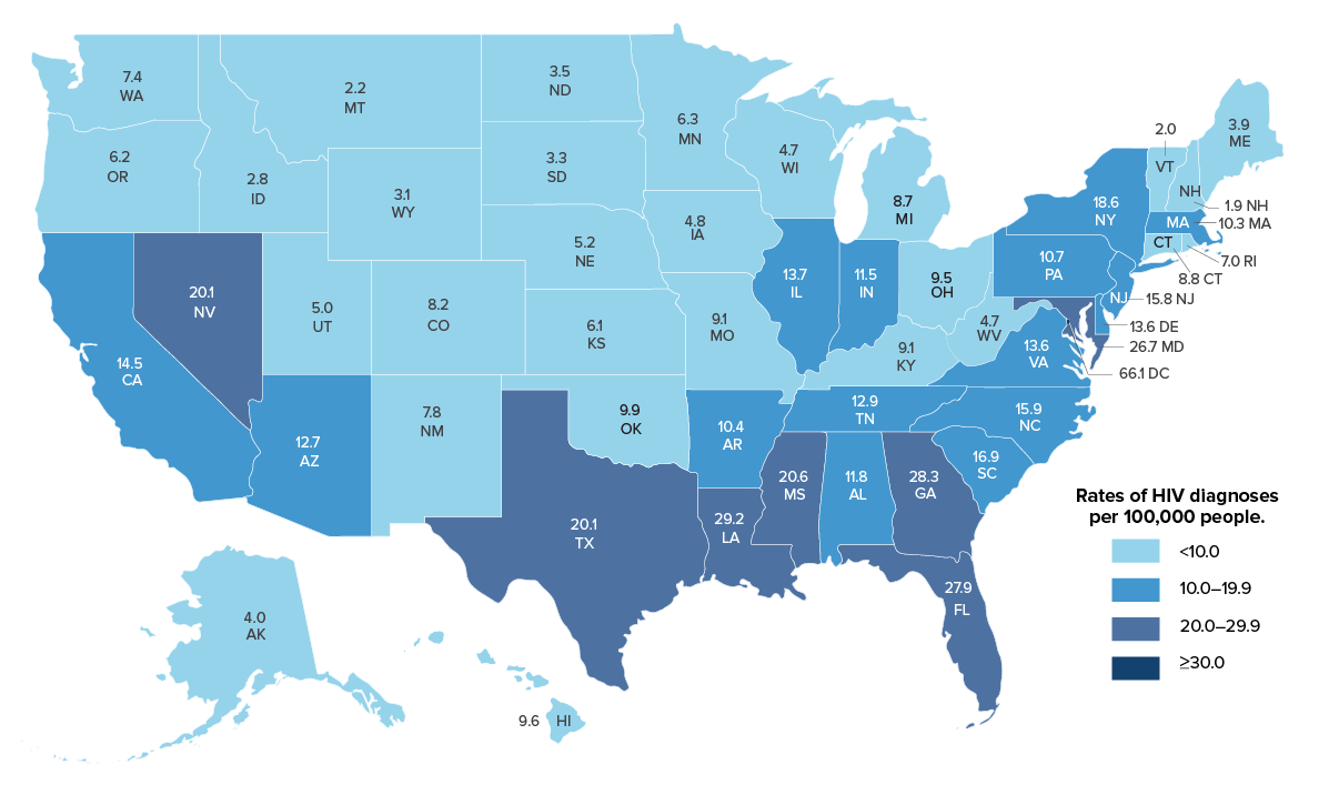
Choropleth (Koropleth not Chloropleth!) map:
- very widely used. the ‘default’ mapping method, especially for social data (e.g. census)
- choro from choros (place) and pleth (value);
- aggregate data, usually ratio or percentage - not absolute counts as most spatial units are variable in size;
- for discrete spatial units. Purpose is to create a spatial pattern;
- choice of intervals - number and their breaks;
- equal interval, quantiles, natural breaks, standard deviation;
- choice of colors (colorbrewer);
- misleading role of area of spatial units. Larger areas “seem” more important. Best if spatial units are the same size.
- easy produced poorly in GIS, stats software;
- easy to make by computer but often a poor choice for mapping;
- can easily promote false notions of homogeneity inside the shaded areas and sharp cut-off at the borders - real phenomena are more continuous;
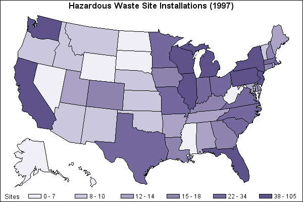
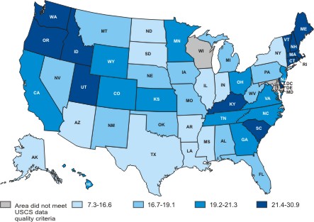
- Quality of design: maps available through an image search. Should be able to find something wrong with the design of all of these maps.
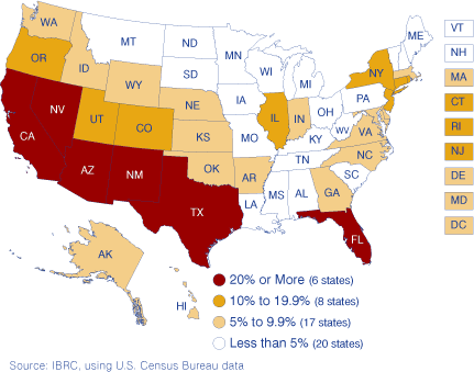
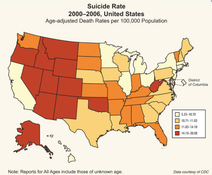
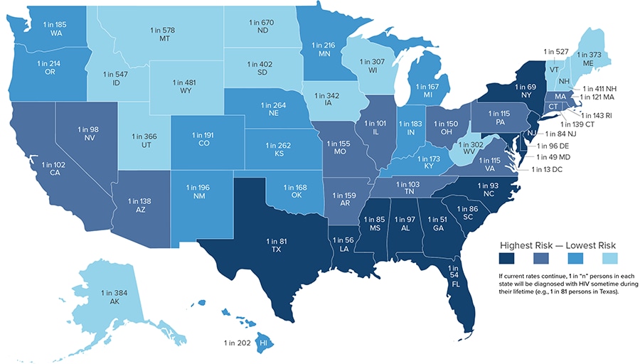
- What's wrong with this unemployment map from this page? What about this map of passport ownership from this page. This is a revision of map by former student.
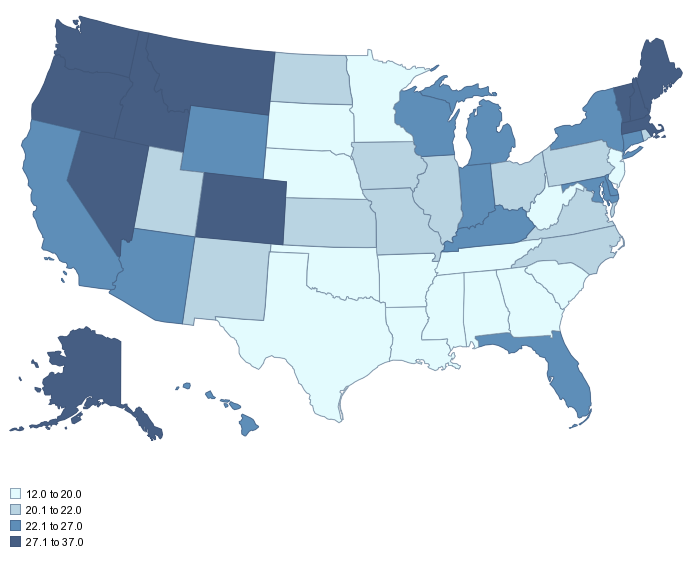
- Other revisions: Unemployment by state |
- Insert finished map into a simple web page entitled Proj4.htm, like this:
<html>
<head> <title> Map of Unemployment in the United States by State 2012 </title>
<meta name="description" content="Awesome Description Here - Use keywords in this description that will allow Google and other search engines to determine what the map shows.">
<meta http-equiv="content-type" content="text/html;charset=UTF-8"></head>
<h1>Map of Unemployment in the United States by State 2012</h1>
<img src=Proj4.png>
</html>
“description” content= tells the search engine what your page or site is about: For the search engine to understand what your page is about, you need to write a good description. When Google's algorithm decides a description is badly written or inaccurate, it will replace that description with its own version of what is on the page. Writing a good description not only helps keep Google from rewriting it, but also helps you get good more people clicking through to your site. A well-written description not only tells users what is on your page, but also entices them to visit your site. A description is what shows up here in the search engine results. It is like good window dressing. Sites with poor descriptions will get less click throughs and the search engines will demote your site in favor of other sites.
- Use this US Outline Map (.ai file) for your choropleth re-do;
- Use layers to separate map elements and colors;
- Save as PNG and PDF;
- Embed PNG into an HTML file with metadata;
- Sign-up for one of these maps on the blackboard.


